Monday, June 22, 2015
Event: Union Gap (WCWA Reenactment)
The WCWA summer season continued this past weekend at Union Gap, near Yakima. While member of the 4th were in attendance, no pictures have yet become available. Further updates will be forthcoming as events warrant.
Thursday, June 18, 2015
What Color?
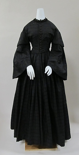
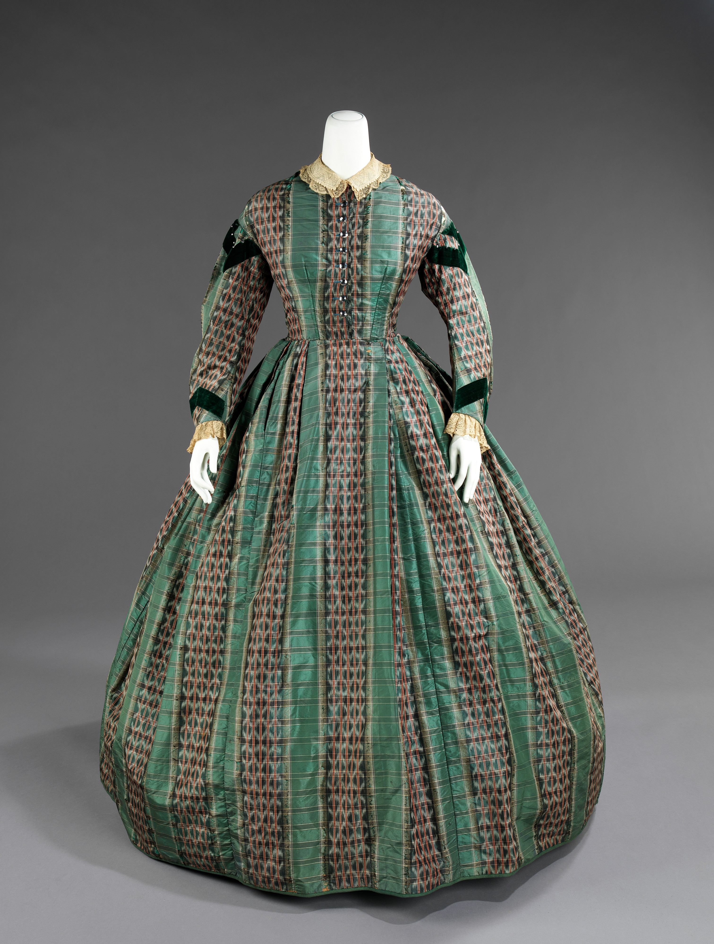 |
| Silk dress, c. 1865 |
An 1861 Peterson's article on "The Use and Abuse of Color in Dress" offers advice for 'harmonizing' colors to one's complexion. Some of the fashionable colors mentioned include "mauve" and "magenta", and readers are advised to use the later sparingly, ideally paired with white or black. Purples, similarly, should be shaded to one's tones, and can be paired with greens to avoid making the skin look yellow. Scientific American (!!!) ran a similar article in 1863. Color in Dress: A Manual for Ladies (1870) develops these ideas further, recommending particular colors for different hair/skin tones, as well as the accent colors with which to pair them. Fair blonds, for instance, may wear light blue bonnets trimmed with white, black, or small amounts of yellow, orange, straw-color, or stone-color (but not purple or pink!).
"How to Choose Colors in Dress" (Peterson's, 1855, starts page 138) discusses how colors look in combination, and how they interact with one's complexion; this is re-visted in the 1858 Peterson's article "Colors in Dress" (page 252), with more attention given to coordinating colors with the hair. An 1855 article in Harper's (page 814) gets into more detail about which colors go well with which skin tones, assuming everyone to either be a dark brunette or a fair blonde. There's this shorter article from 1860 on trim colors and complexion, if anyone's inclined to upholster their coach in a flattering tone.
Our Deportment (1880) is after our period of interest, but includes a thorough list of color pairings (pages 338-343) which, as far as I've been able to tell, correspond fairly well to the tastes of 15-20 years earlier. To give an example, lilac is said to harmonize poorly with white or grey, but its recommended accompaniments include:
lilac and maize
lilac and cherry
lilac and gold or gold-color
lilac and scarlet
lilac and crimson
lilac, scarlet and white or black
lilac, gold color and crimson
lilac, yellow or gold, scarlet and white
Some of the observations, including pink and blue being a weak combination, are echoed in the earlier sources. Others, such as blue being paired with maize or straw color, and with orange (though without the recommended white/black addition), show up in garments of the 1860s:
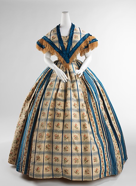 |
| Evening dress, c. 1857-60 |
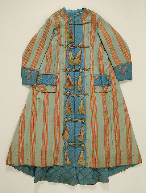 |
| Dressing Gown, 1860 |
I've found no comparable color list from the early '60s, but skimming the colored fashion plate descriptions from Godey's gives a few ideas:
1861: Black with jet; black and gold headdress
Pink and white; gold headdress
Purple and black; white with black and 'straw-color'
Fawn-colored; white bonnet
Light green dress; white with back lace and poppies
Dove-colored and crimson; black straw with black and lemon
'Stone-color' and black; straw with poppy-colored and black
Purple and black; straw with purple
Magenta and black trim (on a dress, main color not given)
Mauve trimmed with a darker shade; white with black lace
Green and white; headdress of gold and pink roses
Gray silk with black
Gray and blue cashmere, with blue silk
Pink and white; white straw trimmed pink
Apple green skirt with a white waist, black velvet trim
Light grey silk with brown spots, trimmed brown; black and white bonnet
Purple with imitation fur, white lining; white and purple cap
Forest green dress; riding hat with brown veil
1863: Blue dress; black opera cloak with gold embroidery; headdress of black lace, roses, and coral
Pink and black skirt, white bodice, black velvet trimmings
Lilac dress "trimmed with a darker shade"; white and black shawl
White dress trimmed pink; black and pink headdress
White with pale blue trim and black lace
White dress with green leaves; green and pink headdress
Apple green dress with chenille embroidery (no color given)
Mauve with black lace; white bonnet with mauve trim
Black dress with violet-colored vest
White dress; green sash and headdress
Blue dress trimmed white and black; headdress of white feathers and wheat ears
Grey foulard (type of pattern/print) silk dress with blue velvet trim
Fawn-colored with green
1865: White silk with crimson velvet; crimson headdress
Lemon-colored silk with white lace
Pearl-grey silk "spotted green" with green trim
Blue and white striped silk with blue trim and white lace
Dove-colored silk with black velvet
Blue trimmed with black velvet
Green poplin trimmed with green velvet
Maize-colored poplin with black
Grey poplin with black and jet
White muslin with pink silk
Light green and black silk, darker green trim
Fawn-color trimmed blue
White with scarlet
Grey with black and crimson
Maize with brown
Mauve with white
Lavender with green and white
Grey with silver buttons
(If the above was unclear, the dress or ensemble is listed first, starting with the ground or dominant color; the headdress or bonnet colors follow the semicolon).
 |
| Silk dress c. 1865 On my monitor, this reads as a orangey-salmon and black striped dress with green trim. On Deportment calls black and orange a "rich harmony", and also recommends pairing orange with green. |
Thursday, June 11, 2015
Mourning Attire
| In Memoriam by Alfred Émile Léopold Stevens, c. 1861 |
-George W. Hervey, The Principles of Courtesy (1856)
Victorian mourning, with its reputation as a morbid and baroque social institution, piques the interest of public and reenactor alike. Living historians may chose to adopt mourning impressions as a teaching tool, to commemorate their own losses, or for any number of other reasons. For those not mourning in modern life, I would recommend reading Miss Connolly On Mourning Impressions before assuming period mourning attire.
 |
| Mourning Dress, 1850s, from the Met |
"Among all civilized modem nations there is a great similarity in mourning customs, and black is universally considered the proper color to be worn, although in the fashions for ladies' dresses modern refinement has gone so far as to symbolize the gradual change from the depth of affliction to a normal state of cheerfulness by a gradual return from black to the gay colors through the intermediate hues of purple and violet, which are recognized as 'second mourning.' The material of a mourning dress is also prescribed by fashion, being for ladies generally crape. The time varies, according to the degree of relationship of the deceased, from a week to a year, the latter being the period fixed by custom for a widow." -The New American Cyclopedia (1861)
| Crepe/crape is a matte fabric, generally silk, with a distinct diagonal texture |
How long one wears the different degrees of mourning varies based on age, relationship to the deceased, means, place of residence, and personal sentiment. The most comprehensive period reference I've found is in Godey's, 1854. It emphasizes the need for one's own sentiments to dictate the terms of mourning apparel, and suggests that white be worn both to mourn children and by children in mourning. Though condemning codified mourning, it give as an example "one year for a parent, husband, brother, sister, or child. Six months for grandparents, uncles, or aunts. Three months or six weeks as a token of respect to the memory of a cousin, friend, or remote relative, or anyone who leaves the wearer a legacy." For public figures, or classmates, or fellow members of clubs, or for soldiers attending officers' funerals, mourning badges, mourning rosettes, and/or crape armbands might be adopted. In other public instances, as for royalty, slight mourning may be worn ("court mourning", for those attending on the royal family, can be highly formalized).
 |
| Reproduction of an original mourning badge/cockade honoring Abraham Lincoln. |
| Funeral of a Child (1863) by Albert Anker. All of the adults wear black, excepting the grave-digger's shirtsleeves and tan vest, and one man's beige jacket. Some children wear black, but most are dressed in plain normal colors. |
 |
| From Graham's Illustrated Magazine, 1857 |
"Full Mourning. --Bonnets for full mourning are in the usual full-dress shape--made of crape and grenadine, trimmed with black blonde and a crape veil, with transparent crape strings; it is relieved with jets and bugle ornaments on the outside, which also mix with the blonde underneath.
Second Mourning.--Bonnets for second mourning are composed of quadrilles of black and gray ribbons with straw. Purple has been the fashion to mix with black in the composition of second mournings; but it is now considered too heavy, and more appropriate for winter--the colors of gray, straw and lilac being in better taste for the spring season. The flower ornaments are generally lilac and mignonnette, mixing with the white blonde underneath, and with the foliage and ribbons on the sides..."
-Graham's Illustrated Magazine, 1856Godey's informed us earlier, of course, that "the plainest mourning is also the most ladylike", and most sources agree to this for the earliest periods of mourning--the fashionable twists comes later if at all. "It is absolutely necessary that it should be severely plain (emphasis original)", says The Courant (1862). Initially, one dons all dull black attire, including dress, bonnet, outwear, and even the "white accessories" (collar and cuffs/undersleeves); trims are kept to a minimum, and little or no jewelry is worn. The Lady's Self-Instructor in Millinery and Mantua-making (1853) recommends making collars and cuffs of book muslin, and then covering them with black crape, while bonnets are to be made of black silk with crape trims (including the ties), or to be covered with crape for deepest mourning; white muslin, crape, or net are used for later mourning collars. Whatever may be said of fashionable grades of mourning, the plain black attire, and the black trimmed in white are staples of period literature:
"She was dressed in the deepest and plainest mourning, totally without ornament..."Littel's Living Age, 1866
"... He admired the softening effect which the plain white collar and cuffs had upon Annie's dress. When he was home before, everything about her was black of the deepest dye; but now the sombreness of her attire was relieved somewhat..."- Rose Mather, an 1868 novel about the war.
 |
| Arthur's Home Magazine, 1860 |
 |
| This "comfortable and elegant wrapper" can be made up for mourning wear in "black delaine, with a trimming of black silk quilted in white." Peterson's, 1862 |
In 1861, Godey's even mentions gold thread applique being used in first mourning in England (but insists that the women of Philadephia will never adopt such a custom, even if the women in New York might do so).
While black is agreed to be the primary color of mourning, second mourning can get more ambiguous. In 1858, for instance, a description of second mourning in Godey's admits only black and white for second mourning colors, insisting that purple and lilac are not and have not ever been real mourning colors "though admitted to general wear the past five years." Two years earlier, Graham's Illustrated Magazine mentions that "half mourning bonnets are made of black and purple crape, and trimmed with lace" and that "black and green is becoming the union of colors for second mourning." The next year, 1857, Arthur's Illustrated Home Magazine names 'purple and mixtures of black and white', or 'black and purple' the colors of half-mourning; it also prescribes black gloves for mourning wear and purple or lilac for second mourning. Frank Leslie's Monthly praises small "grey, lavender and lilac" prints on black, which are apparently popular in 1860, and discourages the mixing of second mourning colors in general; the example given is that a bonnet with gray ribbons (not lilac) should accompany a gray and black dress. The July 1860 issue of Peterson's notes that lighter mourning changes with the fashions, and that "a lady may dress very much as her fancy dictates, provided she adheres to black, white, or the shades of purple and lilac, of lead-color and grey, or of pearl-color."
Two possible examples of "lighter mourning" show up the 1861 "In Memoriam" paintings by Alfred Stevens. The first (above) features one woman all in white and bareheaded--perhaps in second mourning, wearing white on account of her youth, wearing lighter mourning on account of a distant relationship with the deceased, or simply wearing white without it being mourning attire. Her two companions, by contrast, are in full mourning: unadorned black gowns with black bonnets and veils. In the other painting (below), we see another woman in deep black mourning with a long veil; intriguingly, the second woman wears a black dress and bonnet, but the bonnet has blue ties, and she wears a bright paisley shawl. What exactly she's wearing is unclear: she might be a sympathetic friend who is not in mourning at all, but has worn her darkest dress and bonnet to show respect for the mourner; she might be wearing blue as a second mourning color, though I've seen no other mention of it; perhaps she is in mourning, but can't afford a full suit of new clothes, and is using a bonnet and shawl already owned (though I wonder at the paisley in that case, as they could get very expensive).
| In Memoriam by Alfred Émile Léopold Stevens, 1861 |
On the subject of already-owned black dresses and bonnets, it is good to remember that not all black attire meant for mourning. "We must promise that the combination of black and white is not at all confined to mourning, but, on the contrary, is one of the most fashionable of costumes." -Peterson's, April 1862 In 1867, Godey's will also remind readers that "black is fashionable at all seasons, and particularly for street wear, even when not necessitated by bereavement."
The plain aesthetic of mourning clothing carries over into mourning jewelry. In 1862, Peterson's notes that "in mourning, the ornaments must be only of jet, or of black enamel, set very plainly. A pin to hold hair, and set in pearls, is admissible, however." Additionally, in second mourning, "tortoiseshell, plain gold, or pearl ornaments, are allowable." Two years before, Frank Leslie's mentions "vulcanized Indian rubber" set in gold as a new material for mourning jewelry, in addition to jet. Hair jewelry, though not strictly for mourning use, can also be made and worn to remember the dead.
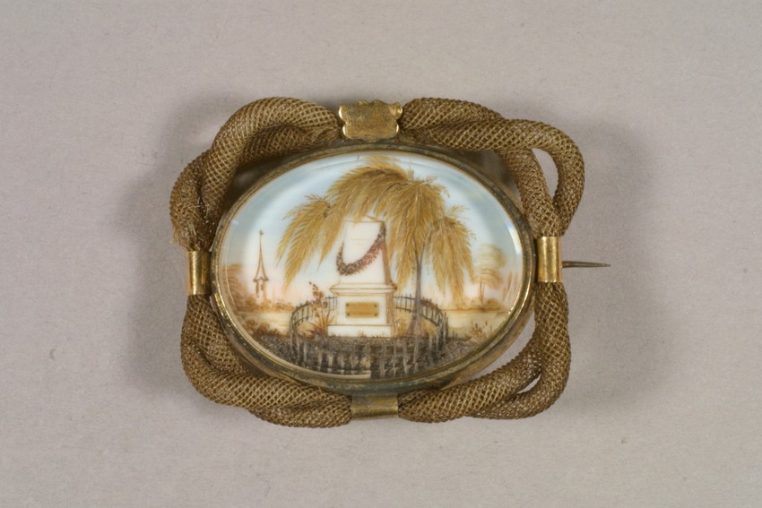 |
| The funeral scene depicted in this c. 1850-80 hair brooch indicates that it is a mourning piece. Hair jewelry could also be made and worn for sentimental reasons. |
In 1862, Frank Leslie's Ladies' Magazine gives extensive descriptions of the different articles available for mourning wear; it contrasts rather sharply with the sentiment-focused tone of the Godey's article from eight years earlier. "The unfortunate war in which our country is now plunged, and the general mourning to which it has given rise, induces us to offer the following hints in relation to mourning fashions..." These include the usual advice about keeping deep mourning attire plain or trimming it with crepe, but also describe white undersleeves and collars with black embroidery, and dinner, evening, ball dresses in black or white mourning.
 |
| Mourning collar and cuffs, 1862; to be made of white 'book muslin' with black and white embroidery and white braid. |
These highly fashionable approaches to mourning attire seem to be the stuff which draws hostility to mourning clothing in general. An 1857 article in The Religious Monthly Magazine makes such complaints in moderate terms, finding fault in the excessive execution of a noble intent. Other sources will be less circumspect in mocking formalized mourning periods or fashionable mourning clothing. Even books addressed to the grieving remark upon the more extreme mourning worn by fashionable city-dwellers than simple country folk, much in the same vein as Godey's earlier remarks on "half mourning" really being "fashionable mourning." Nor is this the only strange (to me) juxtaposition of serious mourning sentiment with condemnation of mourning fashions: in 1864, The Family Friend runs a joke about "Gradations in Mourning" right next to a "Rhyme for The Children" about the death of "Little Jane".
Arthur's Home Magazine published an article on "Going Into Mourning" in 1855 (originally excerpted from Susannah Moodie's 1853 Life in the Clearings Versus the Bush), which condemned the practice of wearing mourning at all. More specifically, it reiterates the idea that sentiment and fashion should not be conflated in the public eye, and in doing so offers examples of poor, sincere people either not being able to don mourning, or wasting their little means trying to do so, while richer, shallow people wear fashionable mourning garments for vanity rather than honest emotion. For instance:
"We once heard a very beautiful volatile young lady exclaim, with something very like glee in her look and tone, after reading a letter she had received by the post, with its ominous black bordering and seal--'Grandmamma is dead! We shall have to go into deep mourning. I am so glad, for black is so becoming to me!'"Another example in that piece describes (and condemns) a man attending a ball within a week of burying a child. Apparently this wasn't a singular case: some people in mourning (and even in mourning attire!) apparently attended balls. In addition to the 1862 fashion notes previously mentioned in Frank Leslie's, The Fashionable Dancer's Casket (1856) states that:
"Mourning in any stage--full mourning or half mourning--has always a somber appearance, and is, therefore, unbecoming in a ballroom; but since the custom of decorating it with scarlet has come into vogue, an air of cheerfulness has been imparted to its melancholy appearance."Even people who are truly mourning might not wear mourning. In addition to the cost factor addressed above, some people eschewed mourning clothing at the request of the dying, on account of age, for religious or patriotic reasons, or because they did not care for the custom. The Society of Friends (Quakers) did not wear mourning in the mid-nineteenth century, and some other individuals also found mourning for the righteous dead incompatible with Christian theology. Mourning attire was curtailed during the American Revolution, forbidden during the Crimean War, and abandoned by some during the Civil War, for various reasons of morale, patriotism, and later scarcity of material. At least one (fictitious) woman who lost a son in the war forbore wearing mourning, instead spending the money to aid soldiers.
Not that everyone stopped wearing mourning due to the war; Frank Leslie's (1862) mentions that "the disastrous war now raging...make[s] black, white, violet, and mauve the prevailing colors". In the south, particularly, such things could be difficult to come by:
"I gave $375 for my mourning, which consists of a black alpaca dress and a crape veil. With bonnet gloves and all it came to $500. Before the blockade such things as I have would not have been thought fit for a chamber maid."-Mary Chestnut, A Diary from Dixie, March 15, 1864
This is the current extent of my research into mourning clothing of the mid-19th century, which I hope may prove useful to the reader in his or her own.
 |
| The Soldier's Memorial, c. 1863 |
Friday, June 5, 2015
Research Resources: Period Paintings
Another tool to train the eye: contemporary paintings. These can be a fascinating resource for material culture and clothing in context--as well as activities and attitudes of the time.
For our military men, what fun details can you spot in this 1863 painting?
Children playing, mom in her wrapper with a newspaper and the baby, an apron-wearing servant wiping the dishes. Note the children's headgear as they play soldiers: a folded paper hat, an actual kepi, and I-don't-know-what on the youngest's head. In the background, a draped table and what may be breakfast dishes.
There's all sorts of fun material culture details here. The hand luggage includes a carpet bag with a card on the handle, some red patterned cloth (a shawl?) tied into a bundle, and a stouter cloth pack tied with cords. The young woman has taken off her straw bonnet (unlined, no frill, straw curtain), but still wears her cloak, with the hood off; the mother wears an attached hood drawn over her bonnet, while the third lady has kept her bonnet on. The young man wears no head covering, while the older one in the background seems to have a two-toned hat--a trick of the light? a straw hat with a very broad black hatband? a black hat with some sort of facing on the underside of the brim? a hat with brim and crown of different materials? There's also the characteristics of the train itself--the wooden benches, the open car, advertisements on the wall (contrast to the "First Class", by the same artist, whose occupants enjoy separated, upholstered seats in a private carriage).
So much detail! Blinds and layered curtains on the windows, the identical chandeliers in the two parlors, which are divided by curtains The men have removed their hats, while the women (including the bride!) continue to wear bonnets, save for an old woman in a cap and a young woman bare-headed. Three young girls (bridesmaids?) wear identical striped white dresses with cloaks--on one, you can see a pink waist sash with scalloped edges.
Some Artists to Look Out For
William Powell Frith, British genre painter, 19th century
William Hemsley, British genre painter, 19th century, many paintings of rural children
Winslow Homer, American, 1860s-1900s, slice of life images, include soldiers and leisure activities
Abraham Solomon, a British painter active in the 1840s-1860s; historic and contemporary subjects
Lily Martin Spencer, American genre painter, 1850s-1860s, focused on women and children.
Francis Xavier Winterhalter, German, 1830s-1870s, famous for portraits of royalty.
Other Collections
The Atheneum (you can search by year as well as artist!)
19th Century Genre Paintings on Wikipedia
The Victorian and Albert Museum (use advanced search to find paintings and narrow the year range)
The Metropolitan Museum of Art (ditto)
For our military men, what fun details can you spot in this 1863 painting?
| "Home Sweet Home", c. 1863, Winslow Homer |
| "The War Spirit at Home: Celebrating the Battle of Vicksburg", Lilly Martin Spencer, 1866 |
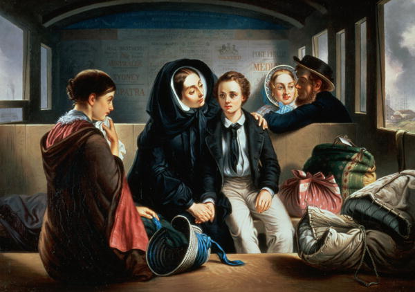 |
| "Second Class: The Parting", revised version 1855, by A. Solomon |
| "Changing Homes" by G. E. Hicks, 1862 (British) |
Some Artists to Look Out For
William Powell Frith, British genre painter, 19th century
William Hemsley, British genre painter, 19th century, many paintings of rural children
Winslow Homer, American, 1860s-1900s, slice of life images, include soldiers and leisure activities
Abraham Solomon, a British painter active in the 1840s-1860s; historic and contemporary subjects
Lily Martin Spencer, American genre painter, 1850s-1860s, focused on women and children.
Francis Xavier Winterhalter, German, 1830s-1870s, famous for portraits of royalty.
Other Collections
The Atheneum (you can search by year as well as artist!)
19th Century Genre Paintings on Wikipedia
The Victorian and Albert Museum (use advanced search to find paintings and narrow the year range)
The Metropolitan Museum of Art (ditto)
Monday, June 1, 2015
Concerning Hoopskirts
 |
| This 1858 illustrator has apparently confused the crinoline with the lightning rod. |
"The circles were all changed to polygons, and at every angle was a neat splice of white cord, or a bandage galloon, or a delicate suture of linen thread, and in one place where the break was particularly bad--a regular compound fracture as the doctors would say--and the steel protruded through the skin, the dear little woman had put it into splints of whalebone, and wound it round and round with bonnet-wire! I felt the tears come into my eyes as I looked at Mrs. Lambswool's hoops.
When did she get that set? I counted on my fingers, and calculated that it must have been at least six months ago. It was the regular old-fashioned Champagne-glass figure and I reflected that had Mrs. Lambswool married somebody besides a poor book-keeper she would have had at least two new sets since that was bought."
--"My Velvet Shoes" in Harper's New Monthly Magazine (1860), hat tip to Jessamyn
Fiction though it may be, this internal monologue by a cash-strapped husband gives some useful insight into hoops in the year 1860. We see how a set may be repaired and made to last by an economically-minded woman; we learn that shapes were changing rapidly enough for six-month-old hoops to be "old-fashioned" (it is later revealed that Mrs. Lambswool turned down a stylish friend's invitation because she was ashamed of her outmoded hoops); we learn that replacing hoops every two months or so is normal for someone who is not struggling financially; we later learn that purchasing hoops is embarrassing for a man, and that many different brands of hoops are available. The new set bought to replace the above has 30-springs and cost $3 (for a top brand); in comparison, $5 was expected to buy a quality pair of men's boots, $0.50-$1 gets a cheap pair of shoes, and $0.50 is paid for a good clothes basket with a lid.
 |
| Hoop in Peterson's, 1858 |
"Hoop skirts--Have become, if possible, still a more confirmed and indispensable article of dress..." - Hesperian (1861)
"Five years ago when hooped skirts were first introduced, every one predicted for them a speedy decline, and fall; but after encountering the shafts of ridicule and opposition in every conceivable form, they still not only remain a fixed fact, but have become a permanent institution, which no caprice of fashion will be like to wholly destroy." -Peterson's, November 1861 (page 384). Current prices at that time for "Demorest's Prize Medal Hoop Skirts" range from $0.50 for a 12 spring skirt to $2.00 for a 40 spring one. Children's sizes are also available, from $0.19 to $1.00. The skirts are noted for their quality construction and cheap cost.
As early as March 1857, Frank Leslie's New York Journal ran instructions for a "hoop petticoat": make a 2.5 yard (90" circumference) petticoat with six tucks, and then insert cane, steel, or whalebone into each. The author finds these petticoats to be more durable than crinoline (the original "crinoline" being a petticoat made of the stiff linen/horsehair material called by that name), as well as cheap and easy to make at home.
A writer for The Saturday Review (1862) had hoped that fashionable women would abandon hoops once their servants started wearing them. He is disappointed that this is not the case.
 |
| Servants' crinolines ridiculed in Punch, November 21, 1863 |
In occupied New Orleans, Miss Clara Solomon writes on Sunday, June 22nd, 1862: “A. is by me grumbling as she is “devoting her whole energy to her hoop”; but these indispensable articles have become much reduced in price, as there had been an influx from Yankee Land, & it is useless to say you will not purchase Yankee importations when the majority of individuals do.”"
A defense of hoops in Ballou's Dollar Monthly (1863) appeals to both the convenience of wearing hoops and to the public stigma of appearing without them. It includes this advice to complaining husbands:
"Now let me advise thee don that coatapet minus the wires, also thy wife's wrapper, just to see how nice thee will feel with thy feet hampered and muffled in the tangling skirts of heavy gowns. I think, too, thee might take a stroll on the shore, where the winds can have a fling at the cumbersome drapery. I trust thee will by that time be quite cured of anti-hoopopathy, and perfectly ready to enthrone Queen Crinoline." (The statement was attributed to a quaker woman, thus the 'thee's.)
While most (I daresay all) of us won't be acquiring dozens of hoops with minute styling differences for each of the years 1861-1865, an over-view of the popular shape will help train the eye. To a small degree, changes in the fashionable form can be imitated by adding a bustle-pad ('tournure' or 'dress improver') to change the back-fullness and adopting petticoats and skirts of varying fullness and set.
 |
| "'The Crystal' hoop-skirt from Sherwood & Douglas; made of boiled bone, this skirt has an 'adjustable tournour' and is superior to last season's 'skeleton hoops'." July, 1856, Mrs. Stephens' Illustrated Magazine. |
 |
| The dome-shaped "Princess Royal" Skirt, Frank Leslie's, 1858. |
 |
| Covered Cage Crinoline, 1858, from VAM |
 |
| Godey's, 1859; This arrangment promises more convenient wearing than the "skeleton skirt", with removable steels for easy laundering |
 |
| Crinoline Ad in La Follet, 1863, the round "dome" has become more conical |
 |
| The "Patent Ondina or Waved Jupon" skirts in this 1864 advertisement show the development of a more elliptical-shaped hoop. |
 |
| 1865 Crinoline from Der Bazar: narrow upper, flat front, and long back |
 |
| Egg-shaped foot-print of the 1865 crinoline |

[Edited to add: Punch did oblige with a cartoon on this topic, January 17, 1857:]

A final note on nomenclature: how did they name their skirt-supports? Searching through Google Books, 1855-1865, "crinoline" is one of the most commonly used general terms, with "hoop" and "cage" being used casually (by fans and detractors alike). "Skeleton skirt" shows up in patent and advertising materials, as does "expansion skirt"; both get rather less usage in fiction, perhaps due to their specificity. "Hoop-skirt" and "hoop petticoat" are also period terms. "Covered crinoline" is used rarely, and only late in the war. The french "jupon" also is used in some publications.
I've found no period uses of the terms "cage crinoline" and "covered cage" in reference to skirt-supports.
Subscribe to:
Posts (Atom)